
Logo: the branding is suggestive of both a rising sun, and the shoulder of a mountain. This was to evoke the meditation and relaxation that the retreat would provide.
I chose a strong lilac-violet, which is a meditative color but the vibrancy of the hue suggest energy.
The upward motion of the word "Raw Me" also suggest this movement and strength, because the retreat is also about empowerment through yoga and self defense classes.

Progression of the logo
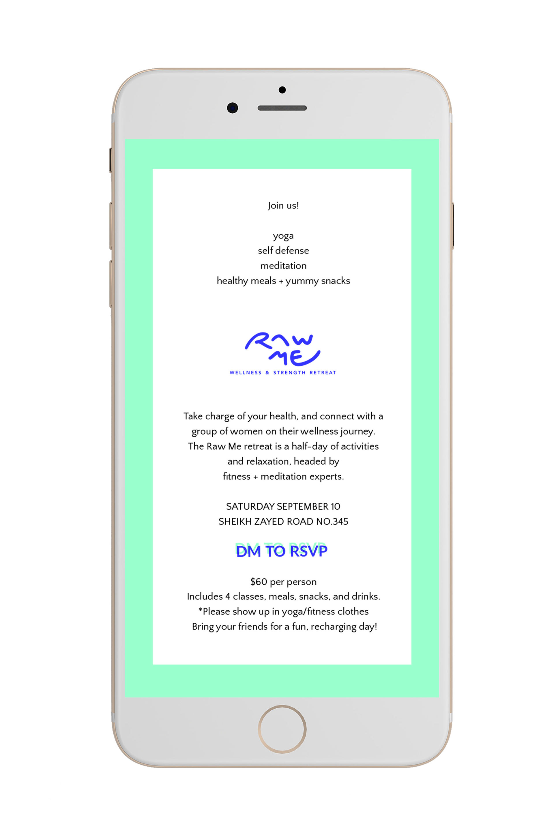
Invitation Page for mobile viewing, includes all details