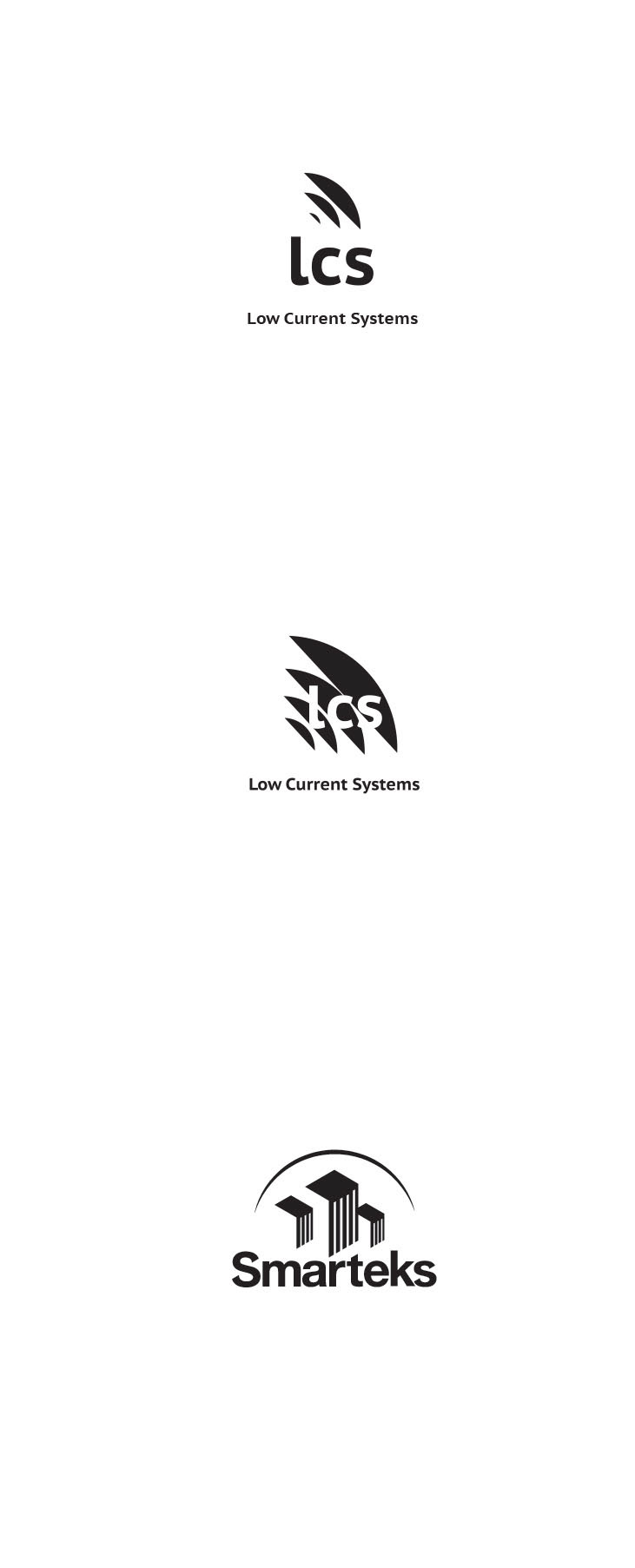
I went through many logo iterations before getting to a non-cliché solution.
I was able to convince the clients to change the name of their company from LCS (Low Current Systems). They decided on Smarteks.
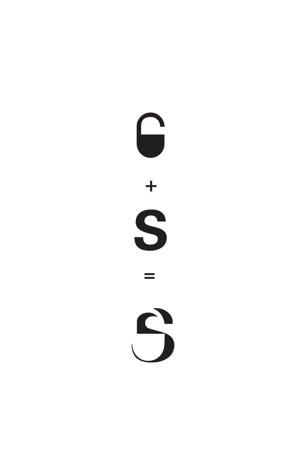
Solution: I married two shapes to create a relevant visual:
I saw that the hollow spaces created in the spine of the "S" could look like a security lock.
Final logo
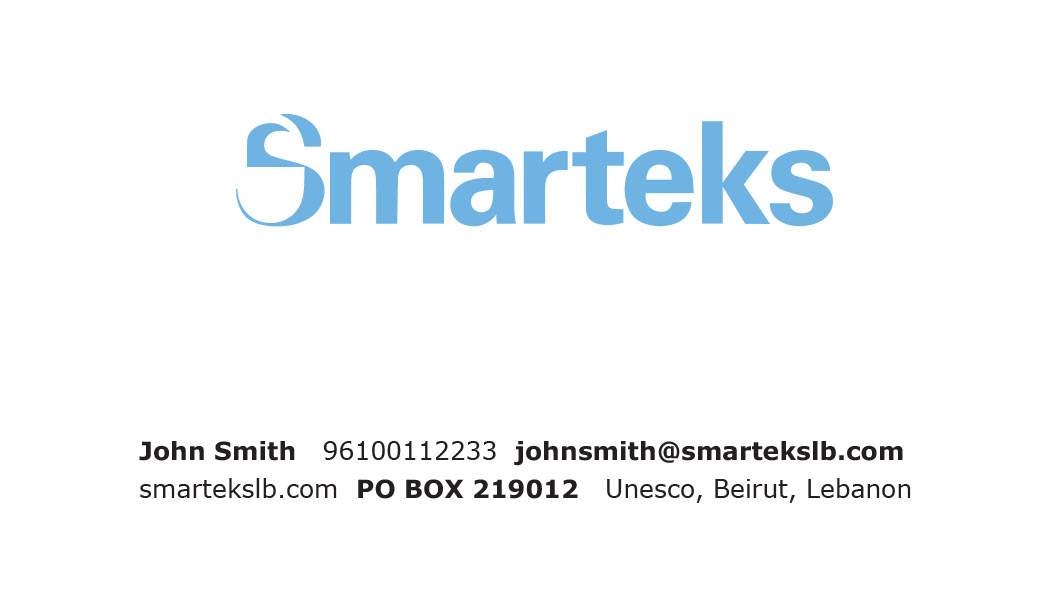
Business card, front

Business card, back
I created little icons to that clients can tell what the company sells & does by glancing quickly at the card