“Umami” is Japanese for the taste of fullness and completeness in food.
As a lover of chocolates, and after many tastings, I put all my efforts into finding the right adjective to describe the taste of chocolate. Velvety, dark, full, earthy, sweet, intense... And I thought about the taste profiles of food, which led me to associate the word “Umami” to these high profile chocolates.
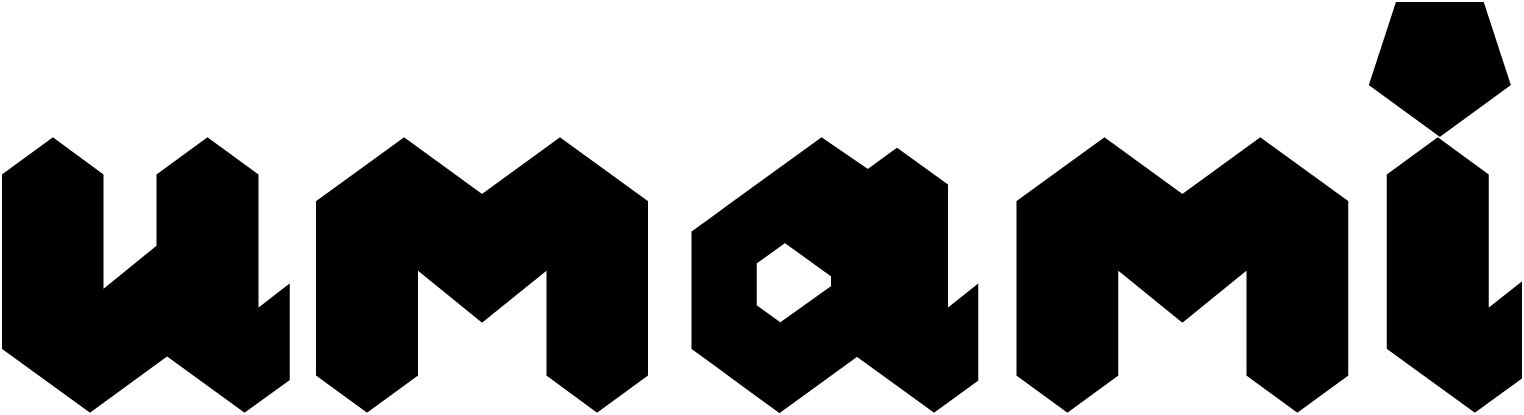
I wanted to include a logomark based on the tongue palate.
A few abstractions later, I settled on the pentagon, because it represents the five tastes coming together to form a full taste, and is shaped like a tongue.
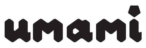
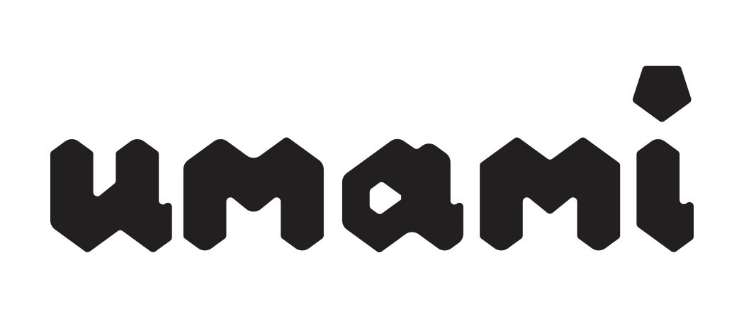
I dropped the mark, and was inspired by the shape to create the geometric typography, as the pentagon’s cousin.
I softened the edges, as a visual reminder of melting chocolate edges.